Themes
Verified against v0.10.0 · web/src/lib/ui.tsx, web/src/lib/theme.ts, web/src/tokens.css
Parley has three theme states, not two: light, dark, and system,
which follows the operating system and changes with it. System is the default,
and the choice is stored in the browser under parley:theme.
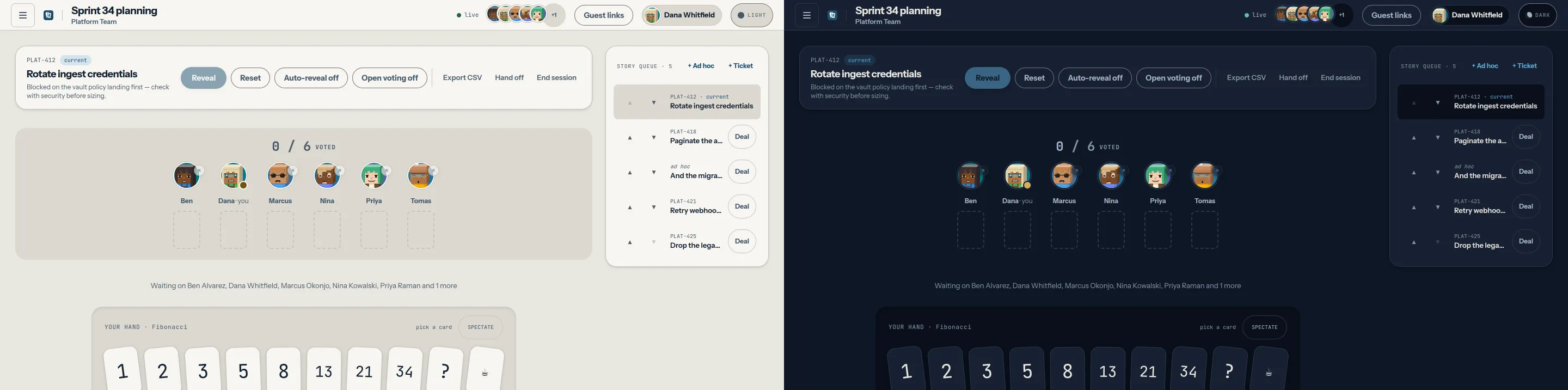
The palette is chart paper and navy ink in light, and a night-watch navy in dark. Numerals are set in a monospace face with tabular figures throughout, because a vote count is data and should line up in a column.
Reduced-motion preferences are respected: the card flip and the countdown ring stop animating when the operating system asks them to.
Theme packs
Section titled “Theme packs”A theme pack is the plugin tier that executes nothing. It is a JSON value
map — never CSS text — so installing one carries roughly the risk of changing a
setting. Parley ships one first-party pack, Beacon
(web/src/themes/beacon.theme.json), a higher-contrast reading of the same
palette.
{ "manifest": 1, "kind": "theme", "id": "parley.beacon", "name": "Beacon", "version": "1.0.0", "modes": { "light": { "felt": "#EFEEE9", "ink": "#0A0F16", "...": "all sixteen tokens" }, "dark": { "felt": "#070C14", "ink": "#F2F1EC", "...": "all sixteen tokens" } }}What a pack may set
Section titled “What a pack may set”The sixteen colour tokens, and nothing else: felt, felt-deep, surface,
surface-hi, ink, ink-soft, ink-faint, line, line-strong, accent,
accent-ink, accent-soft, brass, settled, go, stop. Every one of them
is required in every mode the pack declares; a mode it does not declare falls
back to the built-in palette.
- Values are literals.
#rrggbband nothing else.var(),url(),env(),attr(),!importantand CSS punctuation are all rejected, so a selector or aurl()beacon has nowhere to be smuggled in. - Motion is not themeable. Durations, easings and the reduced-motion rules are not in the contract, so a pack cannot fight a reduced-motion preference.
- The card faces are not themeable —
card-backandpipare artwork.
The host applies a pack by iterating those known keys and setting a custom
property on the document; author text is never concatenated into a stylesheet.
Because the properties land on top of tokens.css, every existing utility
re-themes with no component changes, and removing a pack restores the built-in
palette immediately, with no reload.
The installed pack itself is stored separately from the light/dark/system
choice, under parley:theme-pack; clearing that key uninstalls it.
The contrast gate
Section titled “The contrast gate”A pack is measured against the pairs the interface actually renders, at the
WCAG 2.2 AA level each role requires — body text (ink, ink-soft,
ink-faint, and accent-ink on accent and on brass) at 4.5:1, and the
non-text roles (line-strong, accent, go, stop, settled on each of the
four grounds) at 3:1. A pack that fails is refused unless the failure is
acknowledged explicitly, and an installed pack can always be removed.
Ungated, and named rather than implied safe: line (a hairline divider — the
control boundary is line-strong, which is gated), ink on brass (brass is
a ground for accent-ink, never for ink), the untheme-able card artwork, and
colour-blind separability — a ratio cannot see hue, so a pack can pass every
pair and still make go and stop the same colour to a viewer with
deuteranopia.
What is not here
Section titled “What is not here”| Capability | Status | What to do instead |
|---|---|---|
| A screen for installing a theme pack | Not built | The manifest, validation, contrast gate and application pipeline are in place; the operator surface that installs a pack and resets to the built-in palette is still to come. |
| A verified mobile layout | Not built | The layout is responsive but has never been formally tested on a handset. Use a tablet or a laptop for a session you care about. |
| A per-space theme | Out of scope | The theme is a reader preference, not a property of a room. |